Skip to content
Keybaki
Open the app
Brand assets

The Keybaki logo, icon, and colours.

For press, partners, and schools telling parents about Keybaki. Every file has a transparent background and comes as an SVG plus PNGs at three sizes. Need something not here? Email hello@keybaki.com.

Logo

Logo lockups
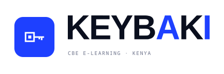
  • Primary logo

    Primary logo

    The default lockup, on white or paper.

    436 × 144 · transparent

  • Primary logo, dark

    Primary logo, dark

    The default lockup, on navy or near-black.

    436 × 144 · transparent

  • Stacked logo

    Stacked logo

    Square or centred spaces, on white or paper.

    328 × 256 · transparent

  • Stacked logo, dark

    Stacked logo, dark

    Square or centred spaces, on navy.

    328 × 256 · transparent

  • Wordmark

    Wordmark

    When the tagline would be too small to read.

    316 × 93 · transparent

  • Wordmark, dark

    Wordmark, dark

    Wordmark alone, on navy.

    316 × 93 · transparent

  • Monochrome, black

    Monochrome, black

    Single-colour print on light stock.

    436 × 144 · transparent

  • Monochrome, white

    Monochrome, white

    Single-colour print on dark stock.

    436 × 144 · transparent

Icon

App icon and key glyph
  • App icon

    App icon

    Avatars, favicons, and social profiles.

    240 × 240 · transparent

  • App icon, navy

    App icon, navy

    Where royal blue clashes with the layout.

    240 × 240 · transparent

  • App icon, mono

    App icon, mono

    White tile for dark or single-colour layouts.

    240 × 240 · transparent

  • Key glyph, royal

    Key glyph, royal

    The key on its own, on light backgrounds.

    261 × 170 · transparent

  • Key glyph, ink

    Key glyph, ink

    Single-colour key on light backgrounds.

    261 × 170 · transparent

  • Key glyph, white

    Key glyph, white

    The key on navy or royal blue.

    261 × 170 · transparent

Colour

Brand colours

  • Royal#1E40FFA + I on light
  • Lavender#B8C7FFA + I on navy
  • Ink#0A0F1EWordmark on light
  • Navy#0A1430Dark backgrounds
  • White#FFFFFFWordmark on navy
  • Paper#F2ECDDWarm backgrounds
  • Muted#6A7088Taglines
  • Marker#FFB84DHighlights

Usage

Using the logo

  • Only the A and the I take the accent colour: royal on light backgrounds, lavender on navy. The K, E, Y, B and second K stay in the base colour.
  • Use the light versions on white or paper and the dark versions on navy or near-black.
  • Don’t stretch, recolour, outline, or rearrange the letters.
  • Keep at least one I-stem width of clear space around the artwork. The padding in each file already covers this.
  • Minimum widths: primary logo 436 px with the tagline, stacked 328 px, icon 48 px. Below that, switch to the wordmark or icon.
  • Use the SVG for print and anything larger than the @4x PNG.